Haven't updated in over a year now, going to get the blog back up and going, projects to be posted soon!!!!

Friday, May 11, 2012
Tuesday, April 19, 2011
Final Project
Graduation Invitation
Purpose: Invite family and friends to a graduation
target audience: Graduate's family and friends (age group has a wide range)
Call to action: attend the graduation, or send a gift
Printing specs:
14"x5"
.125" bleed
.125" margins
has 2 folds
folds into a 5x7
fits into an a7 envelope
Printing cost:
100= $60.63
coated: endurance 32/80# coated 5 x 14
front & back- color
production digital copies
cut: to FinSz (5 cuts/sheet)
2 hand folds
2 scores
$.6063 each
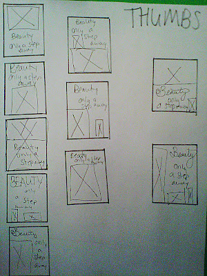
Thumbs


Roughs

Final image


For 100 invitations it would be $60.63
that is including the folds and scoring for each invitation
I used my grayscale raster and my last screen tint for this project to wrap up my master image list.
I really liked the overall outcome. I had a few problems during the making. the background element was too bright and it took your attention away from the text. So i had to changed the pantone color. If i wanted this to be a black and white job I would have just changed it to a different shad of black, but since I needed a screen tint I used a pantone instead. Then I had problems with my 2011 lining up on the front of the invitation so I wound up changing the whole front design. It turns out it was for the better.
I really enjoyed this project and hope it gets put to use soon!!!
Wednesday, April 6, 2011
Publication Ad
Target Audience: Young women 16-28
Call to action: Microsoft tag
Specs: Allure Magazine
8" x 10.875"
.125" bleed
.25" margins
CMYK


Call to action: Microsoft tag
Specs: Allure Magazine
8" x 10.875"
.125" bleed
.25" margins
CMYK
Thumbs

Rough

Final Image

This project was challenging when we first started. We had to do a little bit of math to figure out our bleeds and margins. Lucky for me mine turned to out to be what we normally use.
I used my duotone and COB on this project. I saved my COB /Duotone as an EPS. I also used a vector for the background, which was an AI file.
I learned how to calculate to find the margins and bleeds, and I also learned how to make a vector that has too many points, have less points.
We had to use a microsoft tag as our call to action. We went on the microsoft tag website to generate them. I used my blog for the tag but if this had been a real product the tag would have went to that products website.
© images from istock free images
Wednesday, March 30, 2011
Newspaper Ad
Newspaper Ad Specs
No Bleed
Black and White
$100 Budget
7.71"x 6"
4 Column Width
6 inch Height
My project cost: $96

Thumbnails

Rough
Call to Action: Call, Email, or Visit
Target Audience: Cat lovers, Women, Ages 18-40


Final Version
For this project we had to make a bitmap and scan it in. A bitmap is line art. We had to draw with a black marker on a white sheet of paper, then cut around the drawing. Once I got it on the computer I needed to resize it. So I had to take it into photoshop and change it to grayscale to edit it. Then I changed it back to a bitmap and put it on my project.
© all artwork done by me Emily Smalley
Sunday, March 27, 2011
Looking Around
These are a few photos I took during spring break of certain things that caught my eye or others that are completely random.


This is how most of the signs look around Andover/Wichita. They are very simple and to the point but they also have special typography to them to make them stand out among each other.

This is harder to see, but I really liked how they had lines in with the logo to symbolize water. It went with the waterfront name. Simple but again creative.

I didn't really care for this sign. It has a good mix of colors, but the font seems to playful for a mattress store.

I didn't like this sign at all either. It was way too plain. The green and yellow go together in my opinion but the text color clashes.

I really liked the color and choice of font for this sign. It caught my eye, but I am not too crazy on the layout of the text. It seems like they could have done different placing and made it look better.

This is a Valentines Day balloon I saw. I liked the layout and the colors, but you cant see the word "you" very well at all. If this design would have been put on a different color balloon maybe you could have seen it better, but I'm not sure that the colors would have matched any other color balloon. Though if they would have done stroked type or done a drop shadow maybe the text would have worked out a lot better.

Here is a menu I saw at a restaurant. I like the design, but I don't really like where the name was placed.

This is the first time I have ever seen a Doritos bag look like this. It seems like they changed their design at least for this flavor of chips.
Monday, March 21, 2011
Old vs. New - GAP ATTACK
Gap decided to change its logo after having the same one for over 20 years. This caused more controversy then was intended. After they posted the new logo they got nothing but bad feedback. All their sales went down. As 24/7 Wall Street claims, " It seems that its new logo has gone over about as well as a nasty divorce."
Gap decided to change the logo because they wanted a change. The blue box logo had been used for 20+ years, they wanted to modernize it. They even sent out tweets/facebook notifications asking people to submit their designs for new ideas.
But after this negative feedback they went straight back to their old logo.
Here's a link to check out the difference:
http://247wallst.com/2010/10/08/gaps-logo-change-adding-brand-damage-gps/
I personally think that they should of stuck with the old logo. A logo is how people recognize a company or brand. I think if they wanted to "modernize" they should have changed it up just a little bit. The change was quite drastic from their simple logo to what they changed it to, which was still simple but very different. It also would have been better if they maybe put out a couple new logos and gotten feedback before they actually changed it.
Thursday, March 3, 2011
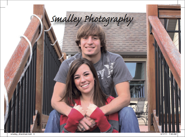
Direct Mail Piece
This project is a direct mail piece. I chose to do it over my own photography. We are supposed to keep the same layout but have 3 different things that change (photo, name, etc.) including the address.
My target audience is high school females, and high school males.
Call to Action: use coupon, or call/ email me.
I chose to do the 7 by 5 inch layout.


 Male Version Front ☝
 Male Version Back ☝
 Female Version Front ☝
 Female Version Back ☝
This project you had to put more thought into then any other projects, because you were designing it two different ways. I came up with this idea very quickly. We had to include a database and instructions with this project. So that was extra stuff we had to do, that we normally don't have too.
My project had 4 different pages. I had a picture that changed on the front of the piece, and a photo that changed on the back of the piece in the coupon section. So that took care of my variable data including the persons address changing.
This is a 4 color project. I used full bleeds. I included one vector object and the rest was done in Indesign besides the photos. I edited them in photoshop. All four of the photos are flattened tiff files. I used catfisch script font. The scissors were little webdings. This file is a 7 inch by 5 inch. The photos had to be sized 7.25 x 5.25 to include the bleed. All I used was black and white swatches. It kept it sweet and simple which is what I was going for.
© All images in this project were done by me Emily Smalley.
My target audience is high school females, and high school males.
Call to Action: use coupon, or call/ email me.
I chose to do the 7 by 5 inch layout.

Thumbnails

Front Rough

Back Rough
Finished Product
Finished Product


This project you had to put more thought into then any other projects, because you were designing it two different ways. I came up with this idea very quickly. We had to include a database and instructions with this project. So that was extra stuff we had to do, that we normally don't have too.
My project had 4 different pages. I had a picture that changed on the front of the piece, and a photo that changed on the back of the piece in the coupon section. So that took care of my variable data including the persons address changing.
This is a 4 color project. I used full bleeds. I included one vector object and the rest was done in Indesign besides the photos. I edited them in photoshop. All four of the photos are flattened tiff files. I used catfisch script font. The scissors were little webdings. This file is a 7 inch by 5 inch. The photos had to be sized 7.25 x 5.25 to include the bleed. All I used was black and white swatches. It kept it sweet and simple which is what I was going for.
© All images in this project were done by me Emily Smalley.
Subscribe to:
Posts (Atom)